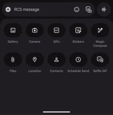
Samsung users are about to experience a sleeker version of Google Messages as a new redesign rolls out. The refreshed app interface promises a more modern and cleaner look, with key changes that improve both usability and aesthetics.
One of the most noticeable updates is the repositioning of the navigation bar. Instead of sitting at the bottom, the bar is now located at the top of the app, aligning it with other Google apps like Gmail. This change offers a more unified feel across Google’s suite of tools.

In addition, the main conversation screen has been cleaned up. Icons have been simplified, spacing has been adjusted, and unnecessary clutter has been removed. The result is a layout that feels more open and easier to read, especially for users who send or receive a lot of texts daily.
The redesign also reflects Google’s ongoing Material You design principles, bringing more consistency across Android apps. With color theming and subtle visual improvements, the app adjusts better to your device’s theme and personal style.
Samsung users will be among the first to see these changes, thanks to Google’s close collaboration with the Korean tech giant. This partnership continues to strengthen, ensuring Android users get access to the latest features early.
Although the update is being rolled out gradually, many users have already started receiving the new look through Play Store updates. If you haven’t seen it yet, keep an eye out — it’s coming soon.
With this overhaul, Google Messages aims to compete more effectively with messaging rivals, offering a platform that not only works well but looks good doing it.


